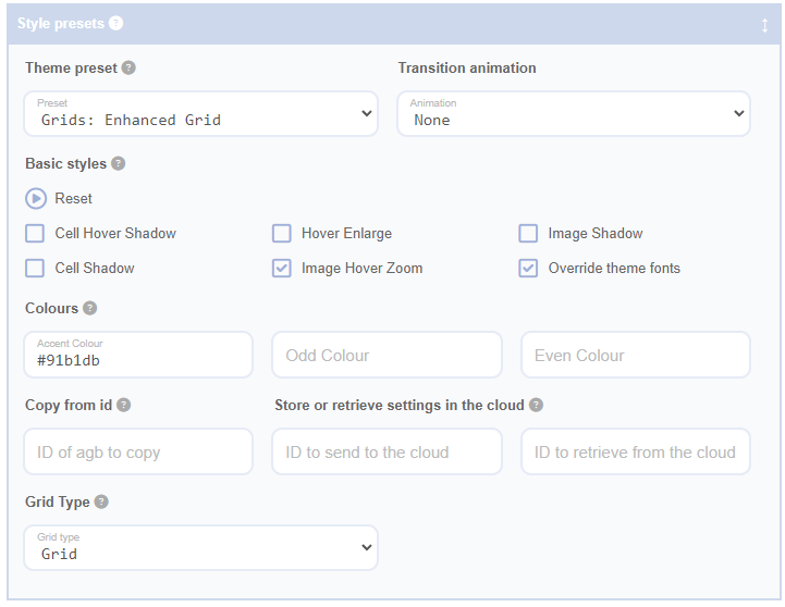
Select a grid type to change the mode of your grid between grid, carousel, accordion, or table. Note that while selecting a grid type will ensure the basic styling and JavaScript behaviours are applied, further settings adjustments may be needed to achieve the desired look and feel. To fully configure each grid type, it is recommended to apply a preset. A preset is a predefined configuration that helps you quickly apply common settings, such as layout, styling, and behaviour. For example, a 'Gallery Preset' might automatically set image sizes and spacing for a consistent look. Some grid types have additional configuration options, such as animation effects, layout spacing, and item alignment, that will be revealed after selection.
The grid is the default style when adding a new shortcode. To maintain the grid style, avoid applying settings for other styles. Main format settings for the grid are available on the Grid Sizing panel.
Galleries
Galleries are a variant of a grid. To create a gallery:
On the Fields Panel:
- Keep only the image field, positioned to the left of the content area.
- Uncheck Content Wrapper to remove all content, including the wrapper, thus eliminating any space it might occupy in your grid.
On the Grid Sizing panel (optional):
- Set an Image Aspect Ratio to standardise gallery image shapes, especially useful when the original images vary in size.
Tables
Tables in Advanced Grid Builder are formatted as 1-column grids with alternating cell background colours, not as HTML tables. From the table options:
- Add fields to the pattern as inline elements. Ensure they’re within the content brackets, which refer to the placeholders that define where the field content will appear in the layout.
- Select Show Table Headers to display field column headers.
- Clear the Inline Separator field.
On the Grid Sizing panel:
- Choose Cell Layout as
Fixed Width. - Set Gaps to
0px. - Select Grid Justification as
Centre. - Use Cell Width as
max-content. - Choose Inline Column Widths as
Same Column.
On the Style Presets panel:
- Set alternating row colours using Odd Colour and Even Colour fields (e.g.,
#fafafa,#eee).
Carousels
Carousels in Advanced Grid Builder use the Slick Carousel JavaScript library, turning any grid design into carousel slides. From the carousel options:
- Choose between Scroll or Fade styles.
- Optionally, adjust additional Carousel Options.
Accordions
Accordions are grid variants where content areas dynamically show or hide via JavaScript when their titles are clicked. From the accordion options:
- Include a title to the left of the content area. The open/close behaviours will be attached to this field.
- Add fields within the content brackets; for example, you could add fields like
text,image, ordescriptionto provide detailed content. This content will toggle visibility when the title is clicked.
